NY Transit Museum
Daring Campaign in mid-1980s.
I remember in 1985 getting handed one of these 7 train flyers on my way from Queens to work in Manhattan. If I recall, a lot of people were offended by the conversational style and the use of the word "Hell." According to the NY Transit Museum, this was an internal campaign designed by the Transit Authority itself. To get a sense of what was considered "typical" of transit communication style, below is an announcement from 1942. Of course the typography is different, but so is the tone.


1942 Poster
“…pursuant to the law authorizing the demolition and removal of the railroad structure…”
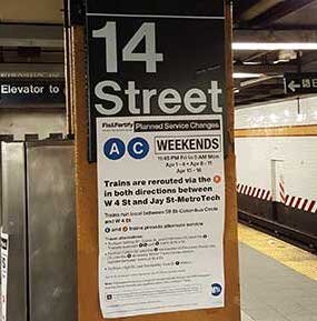
Contemporary Notices
These service announcements will be familiar to anyone who has used the NYC Subway in the last few decades. They are often hand-taped to many of the girders on the platform. Even for those of us who pride themselves on their knowledge of the NYC Transit System can be confused by statements such as this one informing riders of the A and C line that “Trains are rerouted via the F in both directions between W 4st and Jay St-MetroTech.”


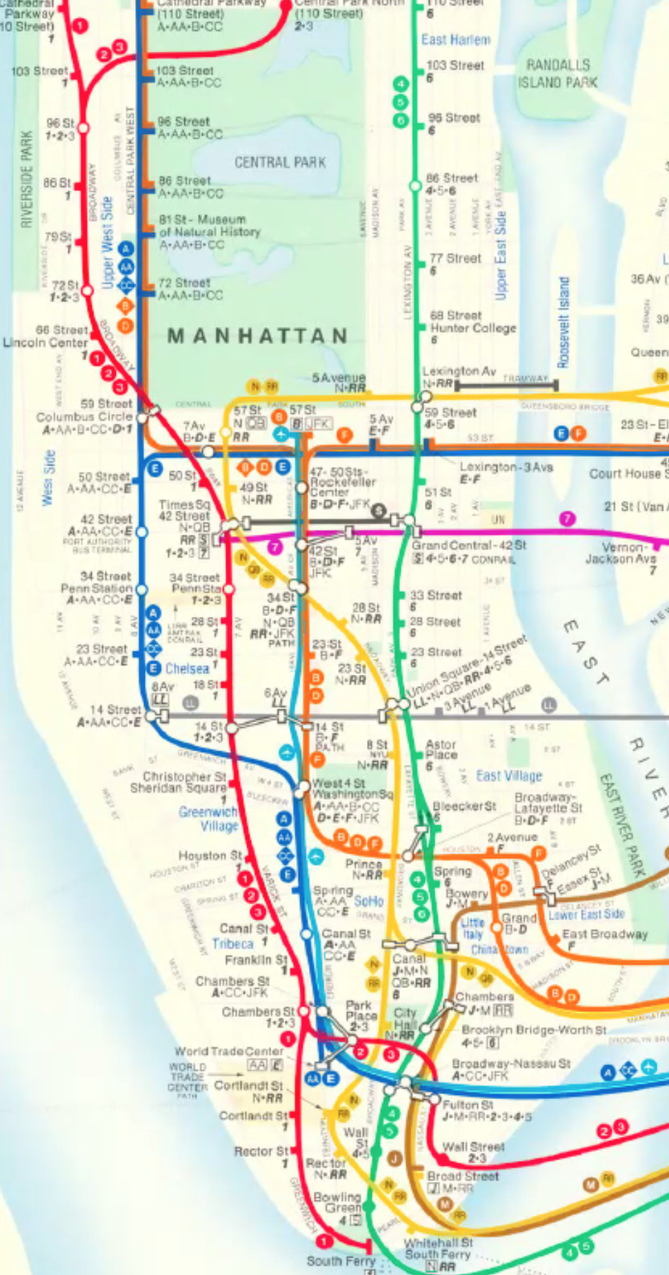
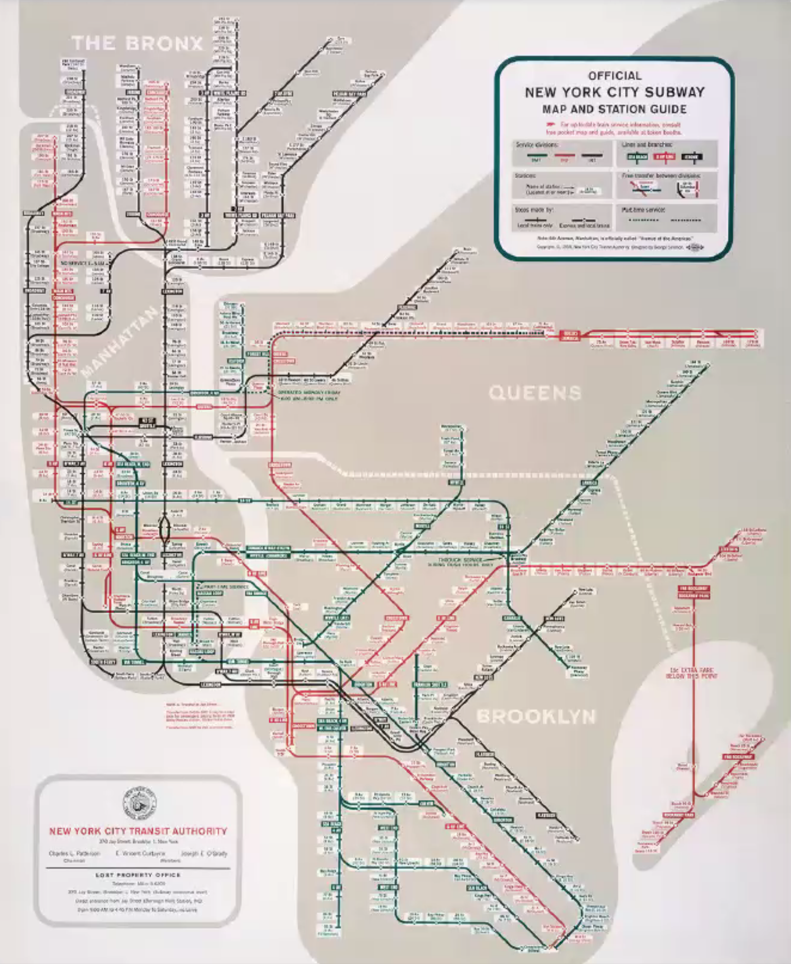
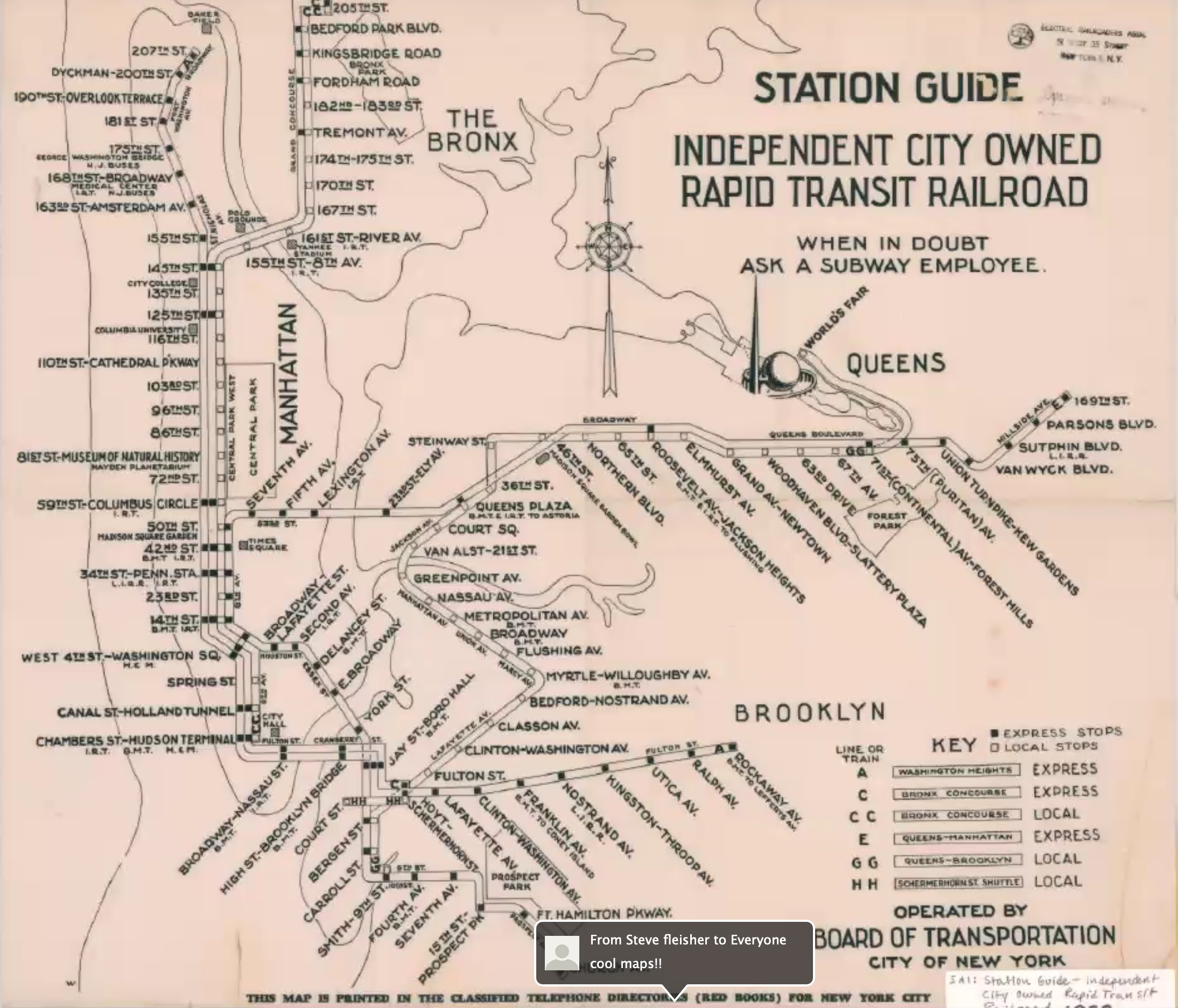
In Search of a Unified Design
Signage featured a jumble of different typefaces and colors before the subway system unified and a consistent design style was applied. Several different vendors produced signs according to the specs of each independent train line. One step toward unification was this plan for tile wayfinding documented below. This plan was realized, and this style of terra cotta signage is visible today in many stations. There are also a few examples of the old names rendered in tile that are still visible today.